Creating a Unity 3D game can be an exciting and rewarding experience, but it’s not always easy. One of the most important aspects of creating a successful game is its user interface (UI), including the health bar. The health bar is a critical component of any game that requires players to track their progress, and in Unity 3D, it’s essential for creating an engaging and immersive gaming experience.
Designing the Health Bar
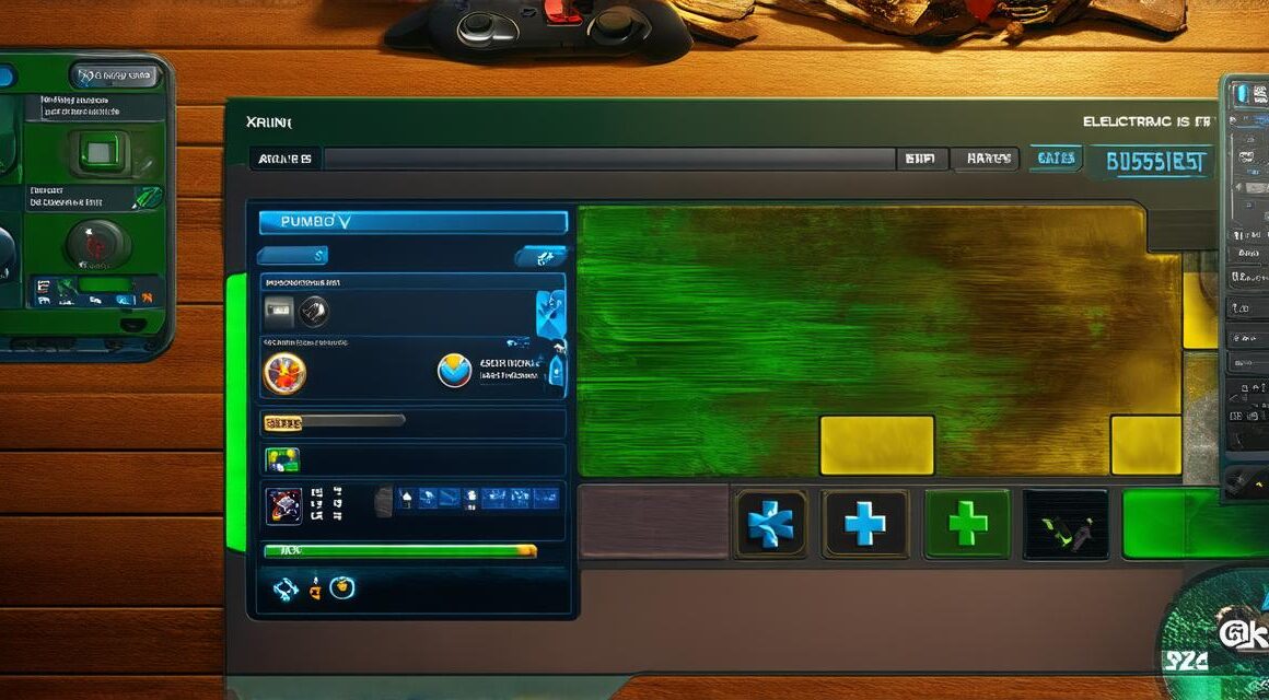
The first step in creating a Unity 3D health bar is to design it. This involves choosing the right colors, fonts, and graphics to create an appealing and functional UI element. When designing the health bar, it’s essential to consider the game’s theme and style. The health bar should be consistent with the overall look and feel of the game, ensuring that it fits seamlessly into the game world.
One important aspect of designing the health bar is choosing the right colors. Colors can have a significant impact on the player’s emotional response to the game, and choosing the right colors can help create a more engaging experience. For example, bright red or orange can indicate danger, while green or blue can indicate health or vitality.
Another critical aspect of designing the health bar is choosing the right font. The font should be easy to read and consistent with the game’s style. It’s also essential to consider the size of the font, as it can impact the player’s ability to quickly read and understand the health bar’s information.
Placing the Health Bar
Once you have designed the health bar, the next step is to place it in the game world. The placement of the health bar is critical, as it should be easily accessible to the player without detracting from the gameplay experience. There are several different ways to place the health bar in a Unity 3D game, including:
- Top of the screen – This is one of the most common placements for the health bar. It’s easy to access and provides players with a clear view of their progress.
- Bottom of the screen – Placing the health bar at the bottom of the screen can provide players with a more immersive experience, as they focus on the gameplay rather than the health bar.
- Side of the screen – Placing the health bar on the side of the screen can be useful for games that require players to move around frequently, as it provides an easily accessible UI element without detracting from the gameplay.
- In-game objects – Placing the health bar inside an in-game object, such as a character or vehicle, can provide players with a more immersive experience and make the health bar feel like part of the game world.
Functionality of the Health Bar
The functionality of the health bar is essential for creating an engaging gaming experience. The health bar should display the player’s current health status clearly and accurately, allowing them to track their progress and make informed decisions about how to proceed in the game.
One critical aspect of the health bar’s functionality is its ability to update in real-time. The health bar should update automatically as the player takes damage or heals, providing players with a clear and up-to-date view of their health status.
Another important feature of the health bar’s functionality is its ability to display visual indicators of the player’s health status. For example, a red color may indicate that the player is low on health, while a green or blue color may indicate that the player has plenty of health left.
